The Technical Challenges of Printing Manga
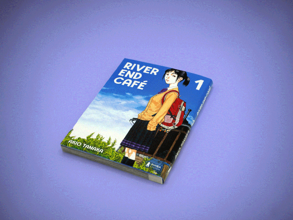
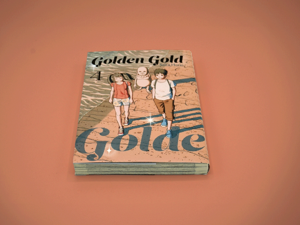

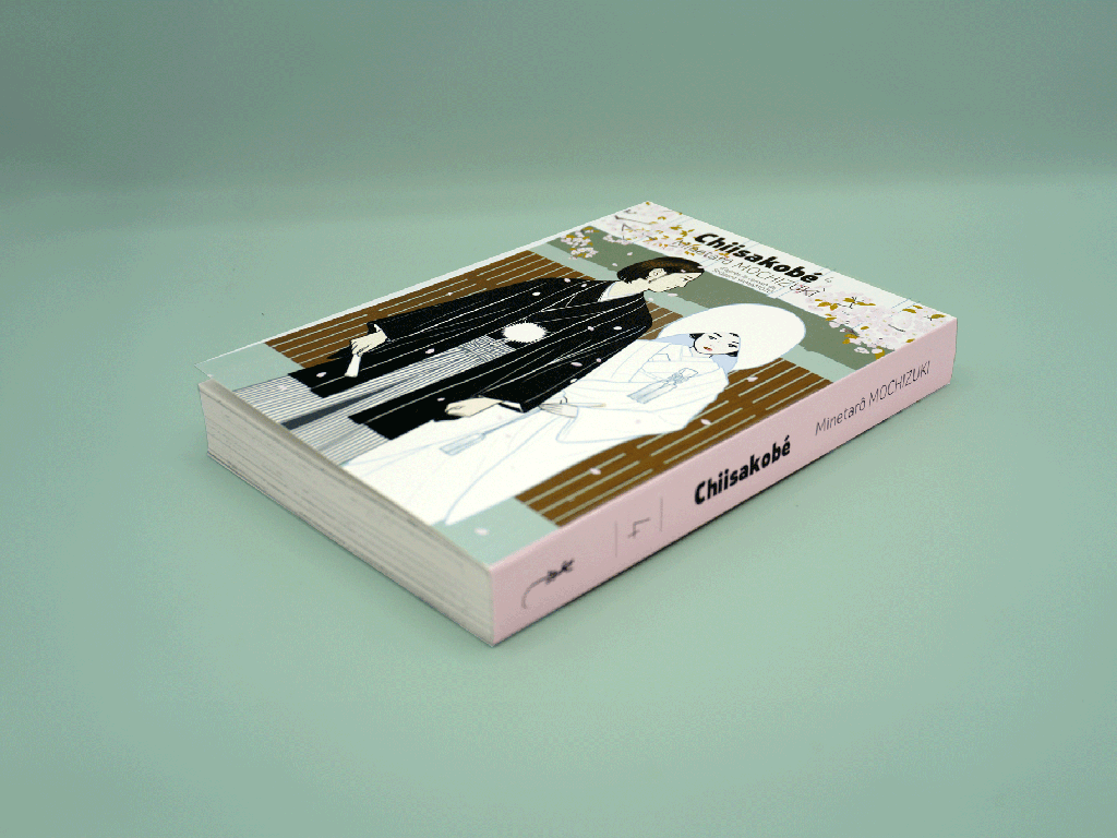
Manga is the fastest-growing segment of the book market right now, and almost every week we’re talking to a publisher who’s thinking about entering the space. They come in with roughly the same picture in their heads: black and white interiors, small trim size, softcover. Simple, right?
Not even close. And the frustrating thing is that it looks simple, which means the mistakes tend to happen quietly. A book comes back from press and something feels off. The blacks look muddy. The screentones have a weird ripple across them. The paper feels wrong somehow. These aren’t random problems. They all trace back to specific decisions, most of which were made weeks before printing started.
So here’s what actually matters.
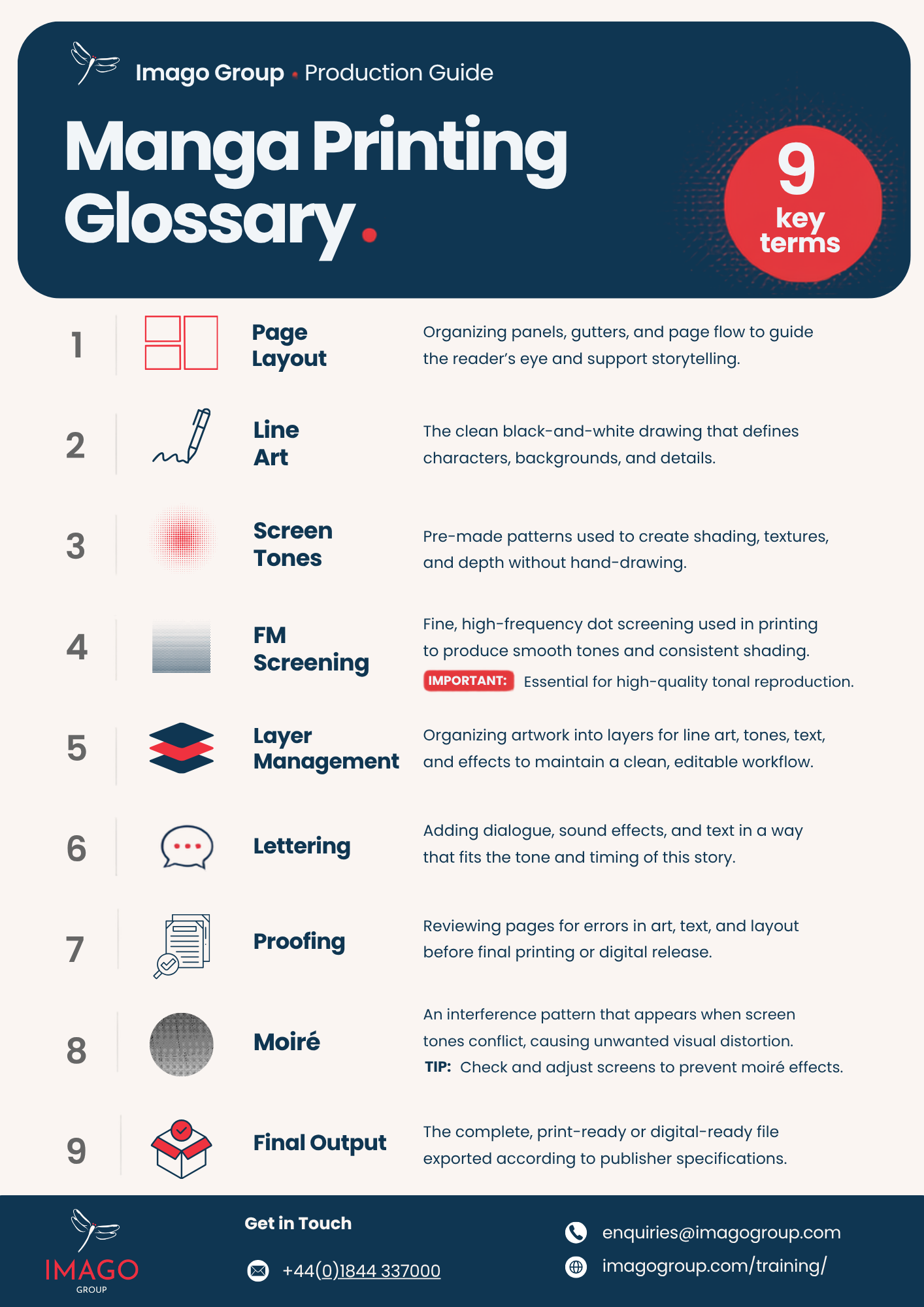
Manga Printing Glossary: Key Terms to Know
Before we go further, it’s worth getting familiar with a few key printing terms you’ll see throughout this guide. Understanding concepts like screentones, FM screening, paper volume, and opacity will make it easier to see what really goes into producing a high-quality manga edition.
Download our Manga Printing Glossary and keep it close while exploring the world of manga production.
Manga styles are not all the same type
The first thing worth understanding is that “manga” covers a pretty wide range of visual styles, and those differences have a direct effect on what you need from a printer.
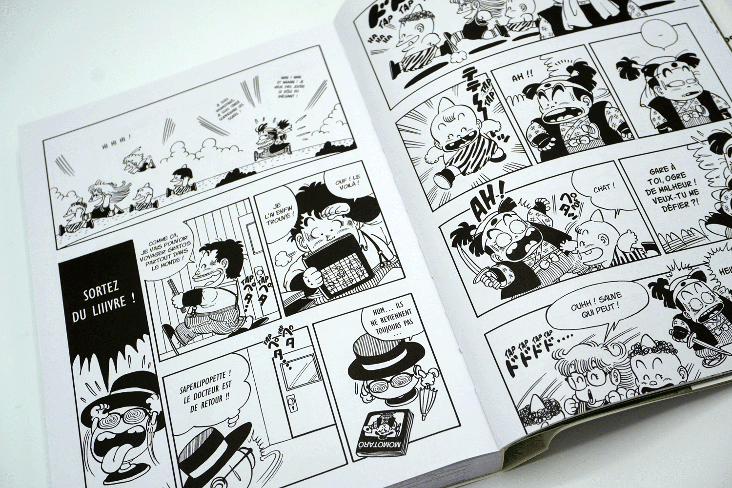
Shonen
Shonen
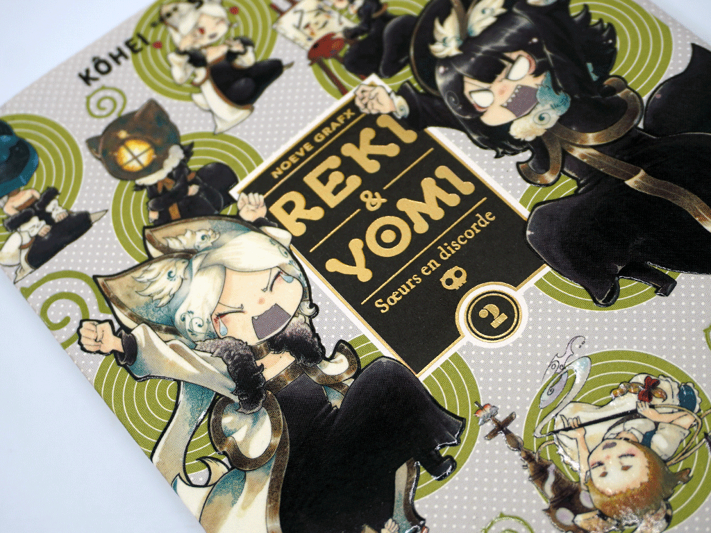
Shonen is the action stuff, young male audience, heavy inking, bold linework, lots of motion and energy on the page. It can handle a certain amount of imprecision because the style is bold by nature. That said, moiré on a fight scene is still going to stand out and look wrong.
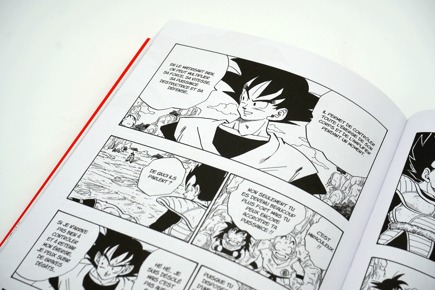
Shojo
Shojo
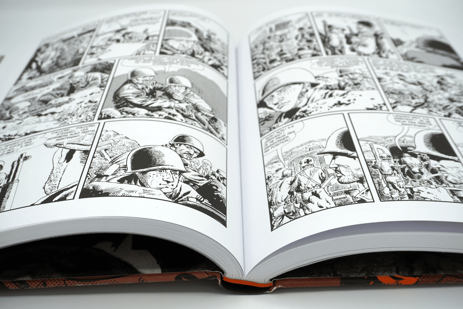
Seinen
Seinen
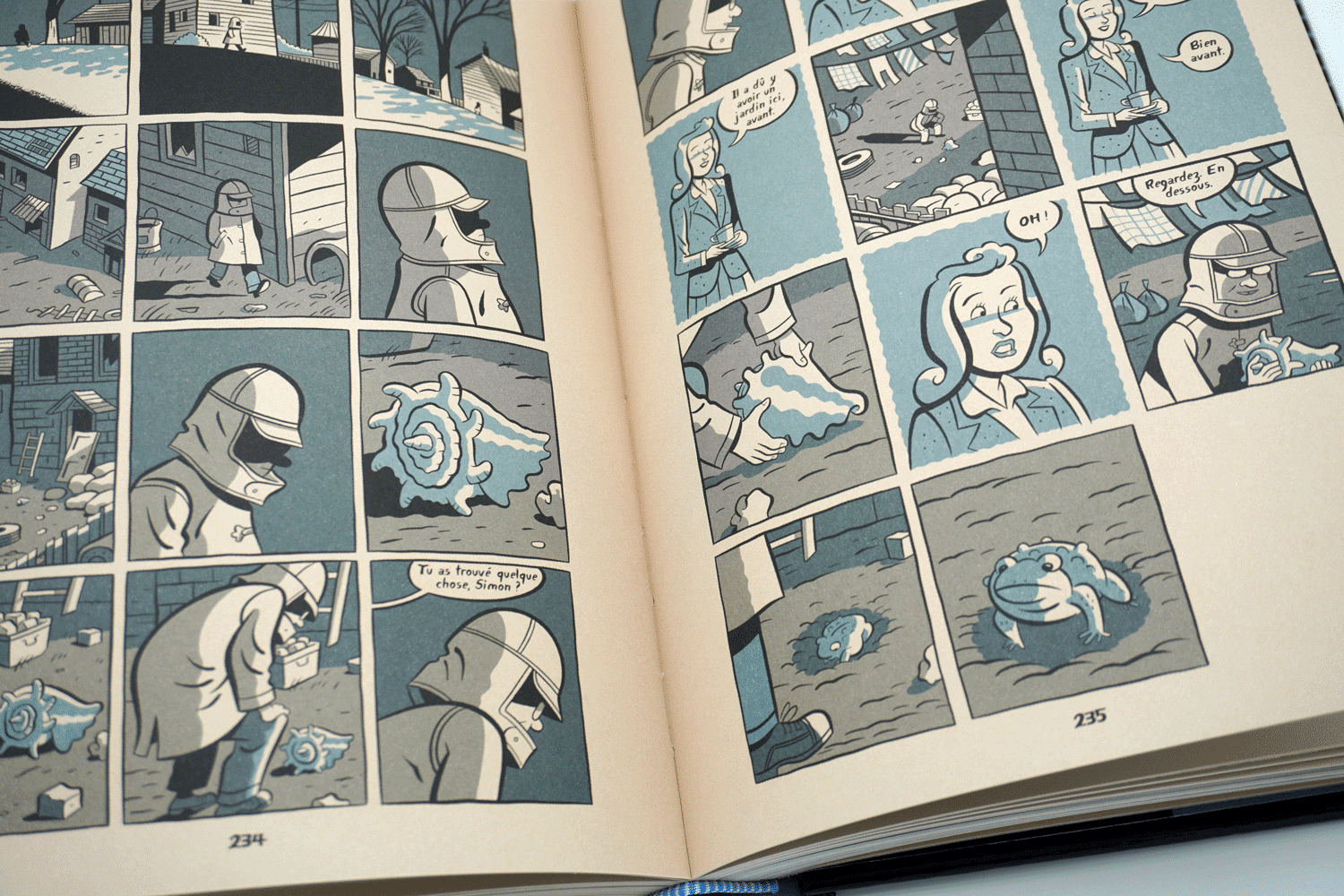
Josei
Josei


Paper is where most publishers make their first mistake
The instinct is usually to go with a standard 80gsm or 90gsm offset stock. It’s what you’d use for a novel, it’s familiar, it works fine for most book formats. For manga it is not what is typically applied.
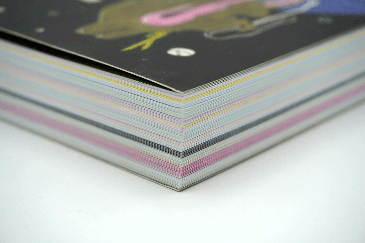
What you actually want is an 80gsm uncoated bookpaper with a high volume, ideally around 2.0. Volume in paper terms means the thickness-to-weight ratio. A high-volume sheet is physically thicker than a low-volume sheet at the same gsm, which sounds like a small thing but makes a big difference in the hand. A 168-page manga on the right paper stock feels substantial. The same page count on standard offset can feel almost weightless in a way that reads as cheap.
Opacity is non-negotiable and it’s easy to overlook. Dense ink coverage, which manga has plenty of, will ghost through a lot of papers that look perfectly opaque as a blank sheet. Always test opacity with actual ink coverage before committing to a stock.
Colour temperature matters too. Japanese manga has a warm, cream-tinted tone to the paper that readers are used to. A bright white stock looks wrong immediately, even to people who couldn’t tell you exactly why.


FM screening is the decision that changes everything
This is the one that we keep coming back to, because it’s the most common technical mistake.
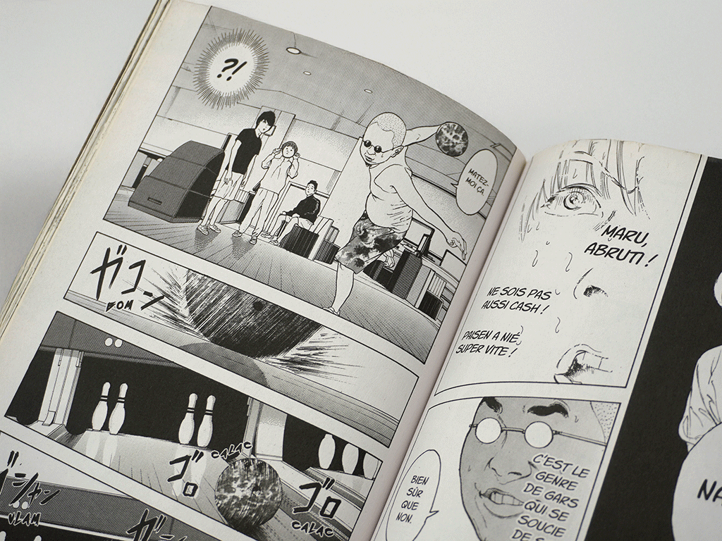
Manga artwork is built on screentones, which are patterns of tiny regularly-spaced dots used to create shading and texture. The problem is that when you print those patterns using conventional AM (Amplitude Modulated) halftone screening, you get interference. AM screening uses its own grid of dots at fixed frequencies, and when two regular grids overlap at slightly different angles or spacings, you get moiré: visible patterns that weren’t in the original artwork and can’t be fixed.
FM (Frequency Modulation) screening, sometimes called stochastic screening, uses randomly placed dots instead of a fixed grid. No regular frequency means no interference with the screentones. The artwork prints clean.
Most book printers use AM screening as their default because it works fine for text and standard photography. Manga is the exception. You need to specify FM screening explicitly and then follow up to make sure it actually gets applied. It’s the kind of thing that gets agreed to in a conversation and then forgotten by the time files go to press.


The binding question depends on where you are in the series
Manga readers are often demanding on their books. Favourite volumes get reread, lent out and carried around, so binding quality matters.
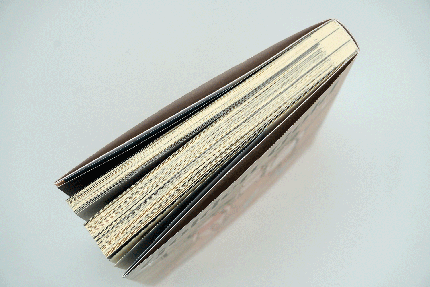
Perfect binding is still the standard choice for many manga editions, but the construction makes a big difference. A well-made perfect bind can last for years.
For longer series, section-sewn binding is worth considering seriously once you’re past the early test volumes. It opens flatter and it’s significantly more durable.
The real challenge is not always getting volume 1 right. It is making sure that volume 8, printed several years later, still feels like part of the same collection. Paper availability can change, materials can be replaced and small differences in colour or finish can become noticeable when all the volumes sit together on a shelf.
This is why choosing a production partner is about more than printing a single title. It is about finding someone who keeps accurate specifications, understands repeat production and treats each reprint as a continuation of the original project rather than a completely new job.
Frequently Asked Questions About Manga Printing
What makes manga printing different from other books?
Manga may look simple at first glance, but its black-and-white artwork requires a high level of printing precision. Fine linework, screentones, textures, and large areas of solid black all need to be reproduced accurately. The right paper, screening method, and print settings can make the difference between a manga that feels authentic and one that loses the detail of the original artwork.
Why is FM screening recommended for manga printing?
FM screening helps reproduce manga artwork more accurately by using randomly placed dots instead of a fixed grid. This reduces the risk of moiré patterns appearing in screentones, which can create unwanted ripples or textures that were never part of the artist’s work. For manga, where shading and tone effects are essential, FM screening provides a cleaner and more faithful result.
What type of paper is best for manga?
Most manga works best on lightweight, uncoated book paper with good opacity and a higher volume. A warm white paper with the right thickness helps create the familiar feel readers expect while preventing ink from showing through the page. The paper choice also affects how the book feels in the hand, especially for longer series.
Why do manga pages sometimes show unwanted patterns or blurry details?
This is usually caused by printing issues related to screentones. When the original dot patterns in manga artwork interact with traditional printing screens, they can create moiré effects or reduce image clarity. Careful file preparation, the correct screening method, and press checks help avoid these problems.
What binding method is best for manga volumes?
For standard manga releases, perfect binding with a well-designed hinge construction is often the most practical option. It offers a good balance between cost, durability, and reading comfort. For premium editions, collector’s releases, or longer books, section-sewn binding can provide better strength and a flatter opening experience.
How can publishers keep manga series consistent across multiple print runs?
Consistency is one of the biggest challenges for ongoing manga series. Paper batches, ink density, and finishing materials can vary over time if specifications are not carefully controlled. Keeping detailed production records and working with a print partner who understands reprints is essential to ensuring volume 1 and volume 10 still look like part of the same collection.
Do all manga genres require the same printing approach?
Not always. Different manga styles create different production challenges. Action-focused shonen manga often relies on bold lines and strong contrasts, while shōjo manga requires extra care to reproduce delicate linework and subtle screentones. Seinen and josei titles can vary widely depending on the artist’s style, meaning each project needs its own production approach.
What should publishers consider before printing their first manga title?
The best results come from making production decisions early. Choosing the right paper, confirming screening methods, testing artwork reproduction, and selecting the appropriate binding before going to press can prevent costly issues later. A strong production partner can help guide these decisions and make sure the final book matches the original creative vision.
Share This: